Dimensional letters and logos are the most versatile category of commercial interior signage. They work in reception areas, conference rooms, executive corridors, building directories, and exterior facades. The same basic concept — individual fabricated letters or a logo element mounted with depth away from the surface — produces dramatically different results depending on material, finish, and mounting method.
Here’s a breakdown of the main options for corporate office environments, with notes on what works best in each context.
Acrylic Dimensional Letters
Painted or colored acrylic cut to letter or logo shapes is the most common dimensional sign material in San Jose corporate offices. It’s cost-effective, available in any color, fast to produce, and produces a clean, modern result that works well across a wide range of office environments.
Standard painted acrylic: Letters cut from opaque acrylic sheet and painted to match brand colors. Mounted with aluminum standoffs at various depths (¾" to 2" being most common). The shadow cast by the standoffs at the right lighting angle adds significant visual depth.
Clear acrylic with printed face: For logos with complex color gradients, photography, or fine detail, a clear acrylic panel with a printed vinyl face applied to the back creates a “floating” effect. The print shows through the clear acrylic for a polished finish.
Frosted or translucent acrylic: Used for interior partitions, conference room glass, and decorative applications where full opacity isn’t desired.
Best environments: Tech startup to mid-stage company offices, medical offices, financial services suites, and any corporate environment where a professional look at a reasonable budget is the priority.
Typical cost range: $700–$2,500 installed depending on size and complexity.
Brushed Metal Dimensional Letters
Metal dimensional letters — aluminum, stainless steel, or brass — are the material choice when the sign needs to project authority, permanence, and quality. The cost is higher than acrylic, but the material reads differently to everyone who sees it.
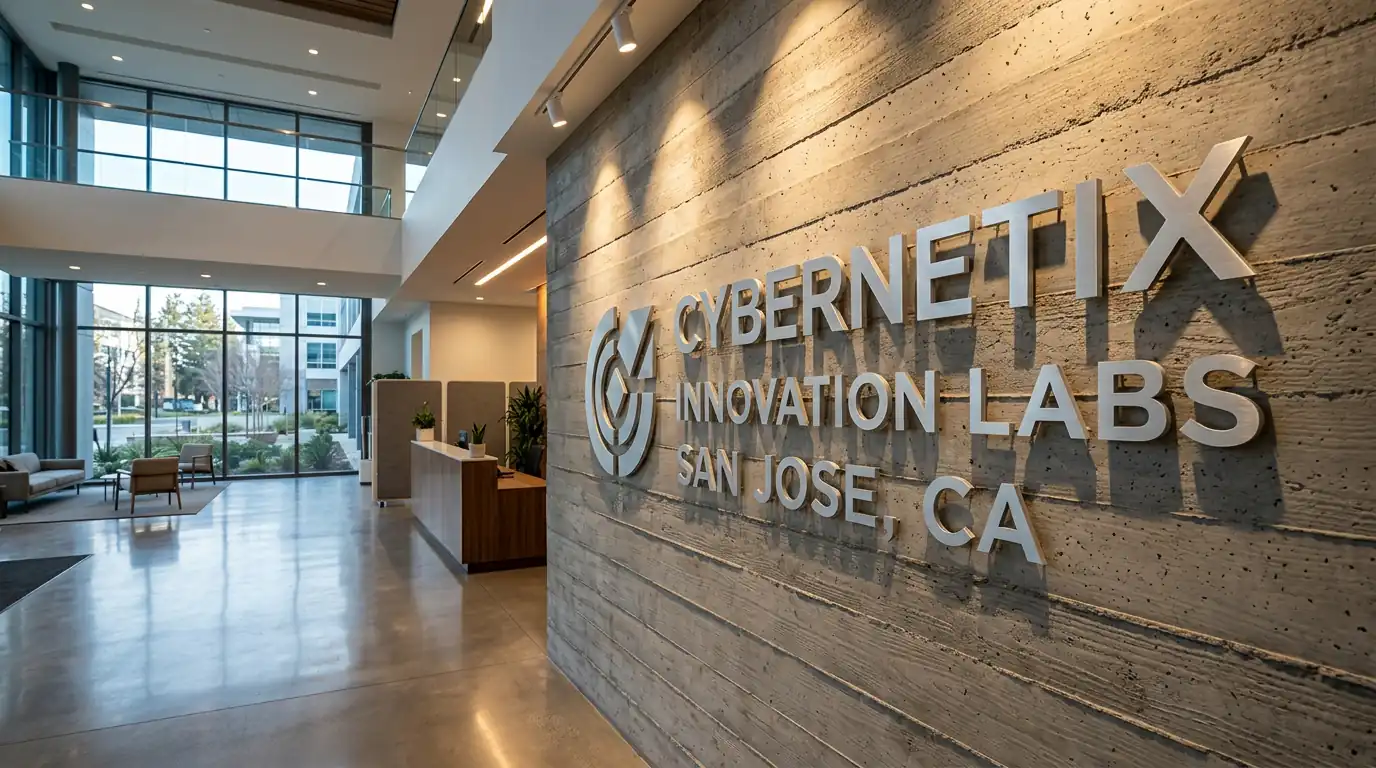
Brushed aluminum: Lightweight, durable, and contemporary. The most specified metal for modern Silicon Valley office environments. Takes a matte silver finish that pairs well with concrete, glass, and dark paint. Available in custom painted finishes as well.
Brushed stainless steel: Slightly cooler tone than aluminum, harder wearing, and higher perceived value. Common in Class A corporate lobbies, financial services offices, and executive environments.
Brass: Traditional and formal. Still specified for law firms, financial institutions, and organizations where a traditional professional aesthetic is intentional rather than dated.
Best environments: Corporate headquarters, law firms, financial services, medical specialty practices, executive floor lobbies, and any environment where the sign will be in place for a decade or more.
Typical cost range: $1,500–$5,000+ installed depending on metal type, size, and finish.
Cast Aluminum — Gemini Sign Products
Cast aluminum is a category above standard fabricated metal letters. The Gemini Sign Products line is the industry standard — individual letters cast in aluminum with extremely fine detail retention, available in a wide range of standard finishes (dark bronze, bright gold, black, and more), and backed by a lifetime warranty.
Cast aluminum is specified for donor recognition walls, institutional lobbies, building entrance identification, and high-end corporate environments where long-term durability and finish quality are non-negotiable.
Best environments: University and institutional buildings, hospital and healthcare facilities, corporate headquarters with a long-term physical presence, donor walls, and luxury commercial developments.
Typical cost range: $2,500–$8,000+ installed depending on letter count and finish.
Mounting Styles and What They Communicate
Flush mount (no standoff): Letters sit directly on the wall surface. Clean and minimal — good for tight spaces and secondary signage locations. Less visual depth.
Standard standoff (¾"–1½"): The most common configuration. Letters float slightly from the wall, creating a clean shadow line. Professional and versatile for most corporate environments.
Deep standoff (2"–3"): More dramatic shadow effect, more architectural presence. Typically used for primary lobby signs in larger spaces where the sign needs to make a strong statement.
Floating on rods (wire-suspended): Used for hanging signs, ceiling-mounted signs, and applications where the sign needs to appear suspended in space. Requires careful structural planning.
Logo vs. Full Wordmark
Full wordmark only: Company name in your brand font, no icon or logomark. Clean and readable from any distance. Works well for companies where the name alone is the brand — common in law, finance, and professional services.
Icon + wordmark: The most common configuration for tech companies. Logo icon to the left, company name to the right, or stacked. Scale the icon larger than you think — it anchors the composition.
Icon only: Works when the brand is established enough that the icon is recognized without the name. Reserved for companies with strong brand recognition in their market.
Full logo lockup: The complete logo as designed, including all graphic elements, faithfully reproduced in dimensional form. The most complex to fabricate but the most brand-accurate result.
What We’ve Installed in San Jose
Recent dimensional letter and logo projects for San Jose area companies include reception signs for JFrog, H2O.ai, Netskope, Mirantis (two locations), Fujitsu, Anritsu, and Think Surgical. Materials across those projects ranged from painted acrylic for startup offices to brushed aluminum for established corporate headquarters.
See examples in our portfolio or visit the dimensional letters page for the full range of materials and options. Request a free quote →