
Not every sign project is straightforward. Sometimes the scope changes mid-production, the dimensions get clarified on-site, and you’re still threading the needle on a July 4th weekend deadline. The Mancini’s Sleepworld Clearance Center installation was that kind of job — and the result is worth showing.
The Project
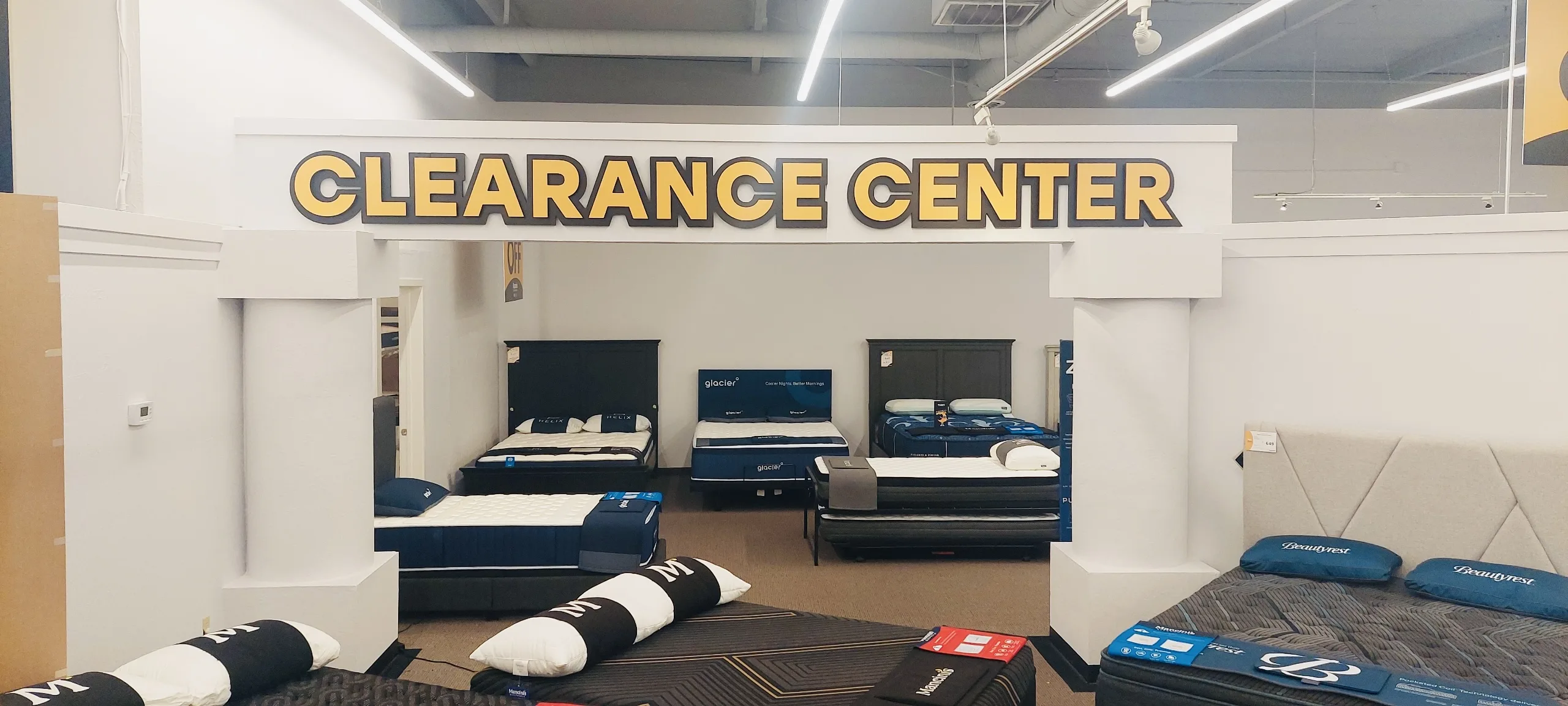
Mancini’s Sleepworld needed dimensional lettering to mark the Clearance Center section at their Blossom Hill Road store in San Jose. The ask was clear in spirit: bold “CLEARANCE CENTER” letters in the brand’s Pantone 136 yellow on black, mounted on the beam spanning two pillars at the back of the showroom floor.
The practical challenge was getting the dimensions right. Initial specs from the client put the letters at roughly 8 feet wide. After a site visit confirmed the actual beam span, the final installed size landed at 190 inches wide × 15.4 inches tall — 12-inch tall letters, which is what the store needed for the sign to read from the front of the showroom.
Fabrication
The letters were produced by our fabrication partner using two-layer direct-print construction on 1-inch Black Gatorboard:
- Back layer: full-bleed black, Zund-cut to the letter outlines
- Face layer: direct-print yellow (Pantone 136), Zund-cut to shape, affixed to the back layer
Both layers were assembled before delivery — the face layer bonded to the back layer, VHB tape applied to the back, with a 24PT installation template included for precise wall placement. No painting involved, which kept turnaround fast enough to meet the deadline.
Installation
The letters went up on the beam between the two pillars using the VHB tape and the installation template. The two-layer construction — black base sitting behind the yellow face letters — creates a clean shadow effect that reads well from across the full showroom floor.
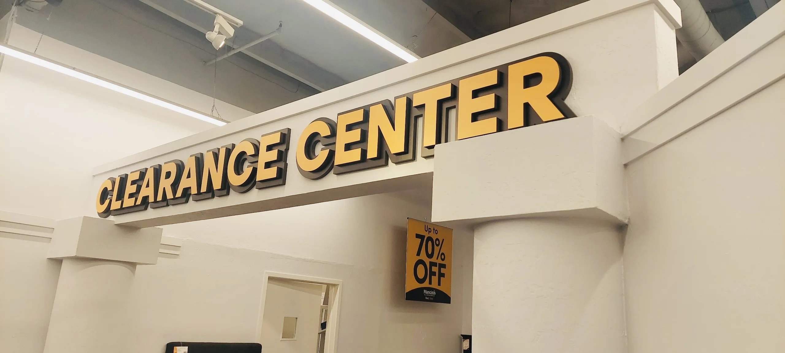
The store manager confirmed the 12-inch letter height on-site after reviewing mockups of both a 10-inch and 12-inch option against the actual space. The 12-inch version fills the beam proportionally and matches the visual weight of the surrounding retail environment.
What Made This One Work
A few things worth noting for anyone planning a similar project:
Vector files matter. The client provided the “CLEARANCE CENTER” text as a vector PDF in Stolzl Bold — that’s what made precise Zund cutting at this scale possible. A rasterized file at 190 inches wide would not have produced clean edges.
On-site measurement before production. Estimating dimensions remotely is fine for budgeting — but for a sign this wide, a site visit to confirm the actual span before locking in production saves everyone from a redo. The beam measurement confirmed the final size and determined the letter proportions.
Gatorboard for speed and weight. HDU foam would have produced a more premium result with painted finishes, but the timeline didn’t allow for a paint partner’s 8–10 day turnaround. Direct-print Gatorboard delivered a crisp, colorfast result with a much faster production cycle — a good call for a retail environment where the sign reads from 30+ feet away.
The Clearance Center letters are now up and doing what interior dimensional signage is supposed to do: clearly marking a section of the store and giving it a finished, intentional look that matches the brand.
Clear Line Signs designs, fabricates, and installs dimensional letter signs for retail, corporate, and commercial spaces across San Jose and Silicon Valley. Get a free quote for your project.