
A single sign can identify a business. A facility signage program has to do more — it has to carry a brand from the parking lot, through the front door, and into a working office space where people need to actually find their way around. That was the brief for Midea’s Emerging Technology Center in Silicon Valley.
The Project
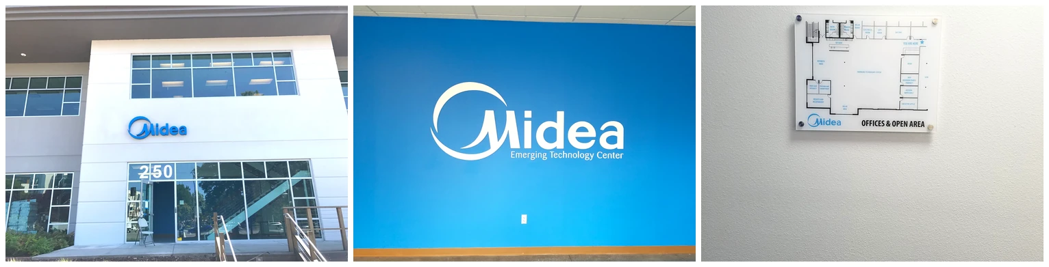
Midea needed three distinct pieces of signage to work together as one system: an exterior building sign to identify the entrance from the street, an interior dimensional letter sign to anchor the brand inside the space, and a wayfinding directory to help visitors and staff navigate the office layout once they’re through the door.
Each piece does a different job, but they had to read as one consistent identity — the kind of thing that’s easy to get wrong if the exterior and interior signage are treated as separate projects instead of one program.
Exterior Building Sign
At the entrance, the Midea logo mark and wordmark are mounted directly above the building’s street-level windows, positioned to be legible from the road and to mark the entrance clearly against a otherwise uniform office building facade. Getting placement right here matters more than people expect — a sign mounted too high or too far from the actual entrance sends visitors to the wrong door.
Interior Identity Wall
Inside, a large-format dimensional sign reading “Midea — Emerging Technology Center” anchors the lobby wall. Rendered as cut dimensional letters and logo elements against a solid color wall rather than a printed graphic, it gives the interior brand presence real depth and a premium feel that a flat print can’t match — the kind of detail that photographs well and makes a strong first impression for visitors and candidates alike.
Wayfinding Directory
The last piece is functional rather than purely branding: an acrylic wayfinding panel showing the office floor plan, with room labels (business area, relax area, executive office, and more) and a “you are here” marker. For a space with a non-obvious layout, this kind of directory does real work — it’s the difference between a visitor wandering the halls and finding their meeting room on the first try.
What Made This One Work
Treating exterior and interior as one program, not two jobs. The letter style, color palette, and logo treatment stay consistent from the building sign to the interior wall, so the space reads as a single coherent brand rather than pieces assembled separately.
Dimensional signage where it earns its keep. The interior identity wall uses raised dimensional letters rather than a flat printed graphic specifically because that’s the piece most likely to be photographed, walked past daily, and used as a backdrop — worth the extra fabrication step.
Wayfinding that solves a real problem. A directory sign only works if it’s accurate and easy to read at a glance. Getting the floor plan, room labels, and “you are here” marker right is what turns a nice-looking sign into a genuinely useful one.
If your office or facility needs signage that works as a system — exterior identification, interior brand presence, and wayfinding that actually helps people navigate — that’s exactly the kind of project we like taking on.
Clear Line Signs designs, fabricates, and installs exterior building signage, interior dimensional letters, and wayfinding directories for offices and commercial facilities across Silicon Valley and the greater Bay Area. Get a free quote for your project.