
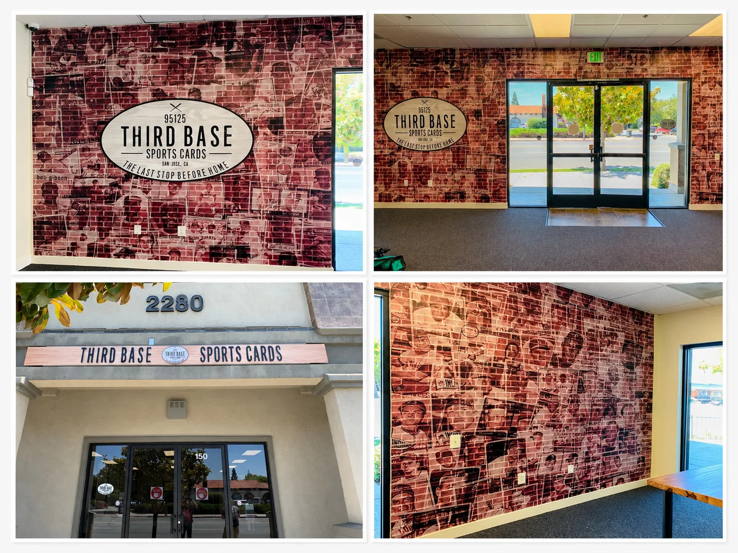
Some retail buildouts need one strong sign. Others need the whole space to feel like the brand the second someone walks in. Third Base Sports Cards, a card shop at 2280 in San Jose’s 95125 zip, needed both — a building sign that reads clearly from the street, and an interior that tells its own story before a customer even reaches the counter.
The Project
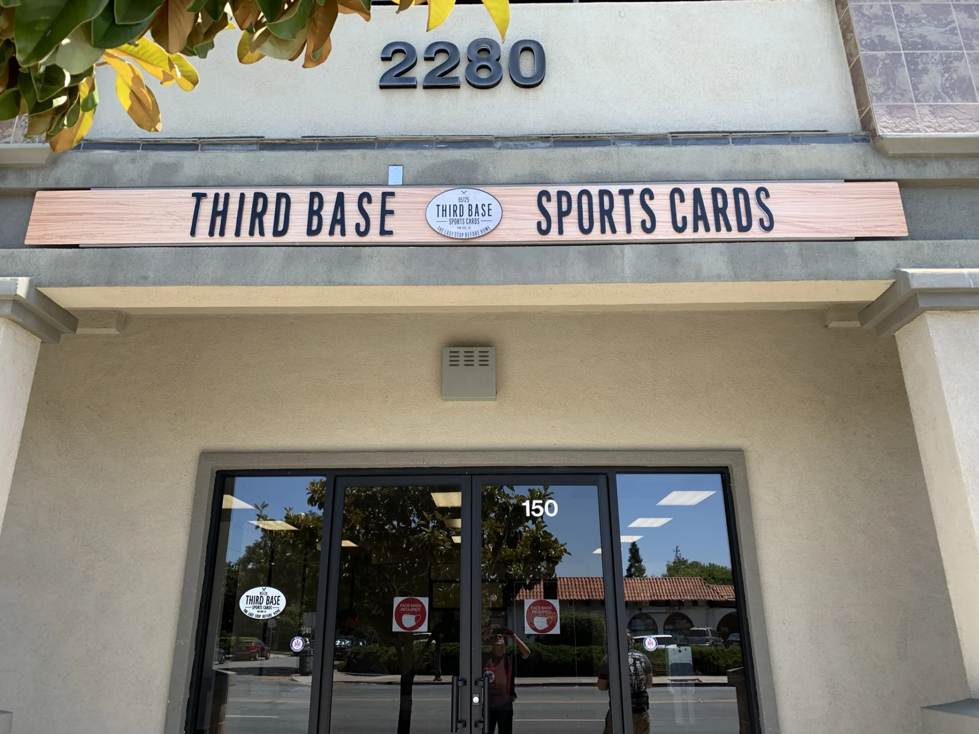
Third Base Sports Cards wanted their entryway to feel like a walk through baseball card history. Instead of a plain accent wall, the interior called for a full wall wrap printed with a collage of vintage baseball cards — Mantle, Mays, Aaron, Clemente, Robinson and dozens more — layered over a brick pattern in a warm sepia tone. Centered on that wall: a dimensional oval logo reading “95125 THIRD BASE SPORTS CARDS · SAN JOSE, CA · THE LAST STOP BEFORE HOME,” mounted so it sits proud of the mural behind it.
Outside, the building needed a sign that would hold up against the strip-center storefront next door. The brief was straightforward: get “THIRD BASE” and “SPORTS CARDS” up in solid, legible letters, with the round logo repeated as the anchor point between them.
The Wall Mural
The interior wall wrap was produced as a large-format printed vinyl mural, applied floor-to-ceiling across the full entry wall. The vintage card collage design gives the space depth and texture without competing with the logo — the sepia toning keeps the wall from feeling busy even with dozens of individual cards layered into the pattern.
The oval logo medallion was fabricated separately and mounted directly over the mural. Building it as a standalone dimensional piece rather than printing it flat into the wrap does two things: it gives the logo a shadow line that reads well under the drop ceiling lighting, and it means the medallion can be swapped or relocated later without redoing the whole mural.
The Building Sign
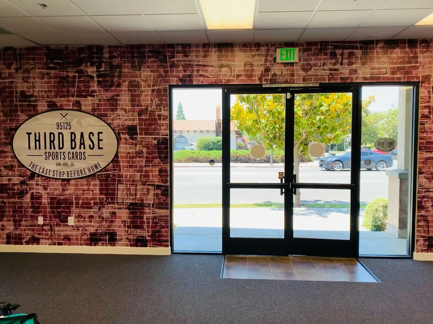
The exterior sign uses a wood-look panel as the base, with “THIRD BASE” and “SPORTS CARDS” cut from 1/2″ acrylic letters mounted directly to the panel — enough depth to throw a real shadow line in daylight without adding the weight or cost of metal fabrication. The round logo sits between the two words as a digitally printed acrylic medallion, matching the interior mural’s branding so the sign reads as one continuous identity from the parking lot to the sales counter.
Mounting the letters and medallion to a single panel instead of individual wall-mounted letters kept the install straightforward — one panel, positioned and leveled once, rather than fussing with spacing on raw stucco.
What Made This One Work
Consistent branding front to back. The same oval logo mark appears on the building sign, the interior wall mural, and the entry doors. That repetition is what makes the space feel designed rather than assembled — a customer sees the same mark from the sidewalk to the register.
Dimensional over flat where it counts. Printing the logo flat into the wall mural would have been cheaper, but mounting it as a separate acrylic piece gives it presence. On a mural this busy, that’s the difference between a logo that reads and one that gets lost in the pattern.
1/2″ acrylic does real work on a budget. For a retail building sign that doesn’t need to be illuminated, 1/2″ acrylic letters on a panel deliver a clean, dimensional look without the cost of channel letters — a good call for a storefront in a shared strip center.
If you’re planning a retail buildout that needs the interior and exterior to match — wall murals, dimensional logos, and a building sign that ties it together — that’s exactly the kind of project we like to take on.
Clear Line Signs designs, fabricates, and installs wall murals, dimensional signage, and building signs for retail and commercial spaces across San Jose and Silicon Valley. Get a free quote for your project.